
2022, "Off the Canvas"
Sketchbook
Inspiration/ color palette

-
Title: The Reception (A Woman of Ambition)
-
Artist: James Tissot
-
French painter and illustrator, moved to London in 1871
-
became famous as a genre painter of fashionably dressed women shown in various scenes of everyday life
-
real interest in femininity and the accessories that suggest it
-
-
Art movement: 1885, Impressionism-Expressionism
-
characterized by visible brushstrokes, capturing a moment
-
-
This piece is part of a series,
entitled “La femme à Paris”, made from 1883 to 1885.

Mood Boards


Each mood board represents a different section of the inspiration image, and in turn will correlate with a design.
Croquis Sketches

flats
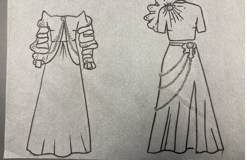

Progress


Design 1
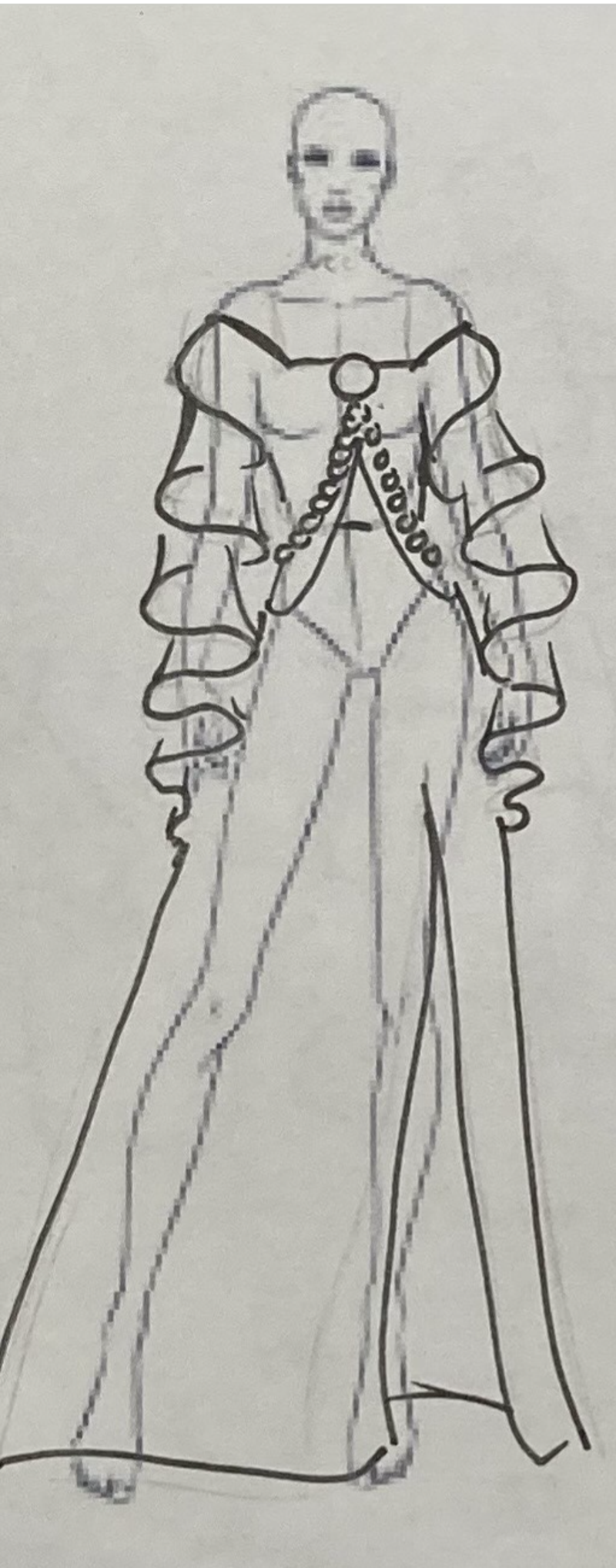


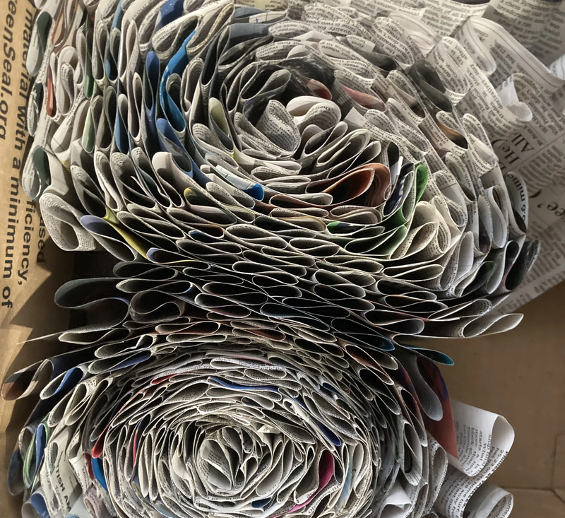
Design one is inspired by the top, left corner of the painting, which depicts a bright, gold ceiling, wall, and chandelier. I drew inspirations from the long, rectangular shapes of the columns and the shiny gold color to create this garment. After adjusting my mannequin to the correct measurements, I draped the fabric and played around with the pleats until I found a shape that i liked. I was able to form the V shape in the seams that mimics the dress in the painting. I created the sleeves by wrapping pleated paper around a sleeve then connecting that to a piece of the original fabric, to create the curved neckline. At this point, I sketched a few more designs to fix the problems I was having. I came up with a few more designs where I then settled for no slit and instead add more fabric in the back of the dress to allow movement. I also decided to add a cape to give an extra element of fun and excitement to the dress.


Design 2


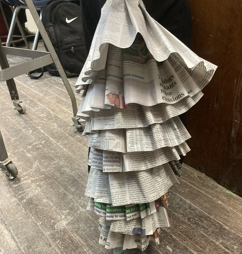
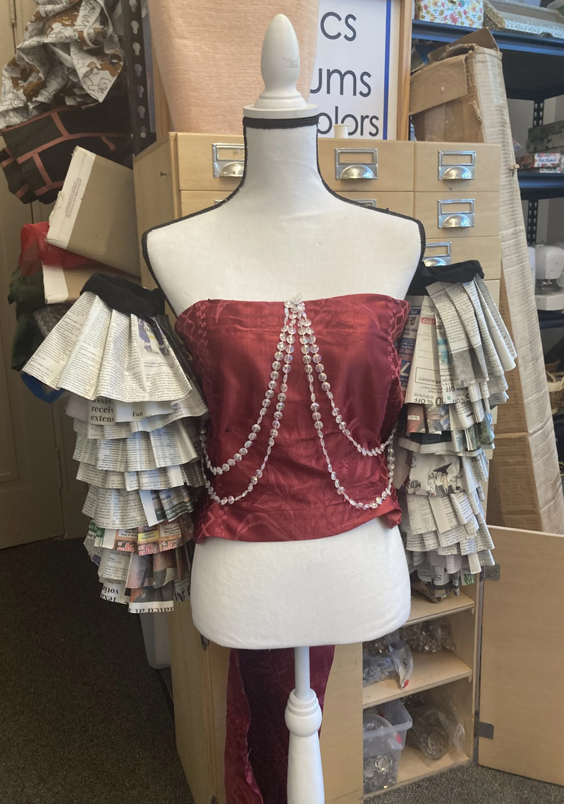
Design two draws inspiration from the main focus of the painting, the women depicted in the center. This dress is meant to mimic her own dress, but in a more modern and junk 2 funk style. I started by drafting a pattern of the desired shape, then used those pieces to alter and refine the details of the pattern to fit the model. From there I crafted the top of the dress out of a stretchy material and finished adding the paper ruffles to the skirt. Lastly, i added the shoulder ruffles and tulle as depicted in the sketch of the design.
Design 3


While the other garments mostly followed their design, this one did not. After some experimenting with some different ways of folding paper and placing it on a mannequin, I decided I didn't like the look of the big ruffle on the shoulder. I scratched that idea and started brainstorming again. When I found the red curtains, I decided to start with just creating a base, a simple V-neck dress. I liked how it looked, so I played off of the V-shaped patterns in the original painting to create the shapes in this garment.
Design 4


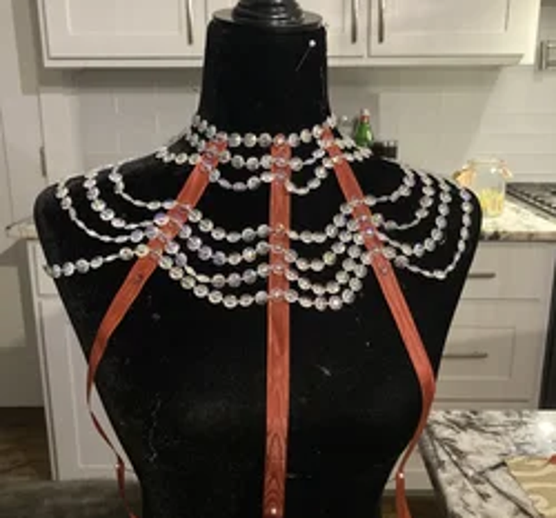

This dress was the only one that required a pattern, after I had trouble lining up the front pieces and the neck piece from my drafts. Using a thick curtain, I created the top of this garment then connected it to a muslin skirt that would be covered with newspaper. Later, a slit would be cut into the skirt to make it easier to walk in for the model. I then switched focuses and started making the main accessory for this garment, the chest piece. Using a mannequin and some ribbon, I drew out the shape I wanted to make. Then I used the crystal beads and paper beads to fill in the spaces to make a draping effect.


runway
'A Woman of Ambition'

'Political Woman'

'The reception'

'L'Ambitieuse'

Create Your Own Website With Webador